This article was produced in collaboration with Hatice Halac, founder and lead consultant at DeciTech and former Head of Credit Ratings Modeling at DBRS Morningstar. Over the course of her career, Hatice has worked with public and private sector financial institutions to solve complex modeling, data, and software challenges, specializing in customer lifetime valuations, direct mail marketing, mortgage price elasticity, loss forecasting, stress testing, home price forecasting, and credit rating modeling. She has a Masters’s degree in finance from London Business School and a Ph.D. in Computational Finance from George Mason University.
Machine Learning (ML) models are commonly viewed as black boxes because it is a struggle to explain the entire calculation process from the data input to the output. Model practitioners have developed numerous methods to better explain ML models, however, this is challenged by the fact that there is not an industry consensus as to what “explainability” means. This white paper surveys the current state of machine learning explainability for financial models and presents a model explainability roadmap for financial institutions to follow. Our approach allows model users to understand and build insights from the output created by machine learning algorithms, helps model developers ensure that their systems work as expected, helps institutions meet regulatory standards, and allows those affected by a machine learning decision to challenge or change that outcome.
Model explainability (interpretability) is a loosely defined concept and does not have a common quantitative measurement. From a qualitative viewpoint, model explainability refers to methods that allow users to understand how a model arrived at a specific decision. Common ways in which model users think about interpretability include:
Global Interpretability: Attempting to understand how a model works holistically; for example, asking which features contributed the most to the model’s decisions. Global interpretability seeks to understand model behavior across all predictions and does not explain a forecast for a specific data point.
Local Interpretability: Why did the model make this specific prediction? For example, lenders will send adverse action notices to explain why a particular applicant was denied credit. This is a local interpretation because it focuses on the specifics of an individual.
Contrasts and Counterfactuals: Model stakeholders often think in terms of contrastive explanations and counterfactuals. If an applicant is denied credit, stakeholders might want to know what needs to change for underwriters to approve the applicant. A model is more explainable if we understand the circumstances that must occur for a model result to change.
Partial Dependence: Isolating the specific contribution of a feature (or set of features), by perturbing the feature and holding the other features constant. This is a useful technique for gaining insights into model behavior but can lead to incorrect conclusions if features are highly correlated. Also, it is difficult to analyze more than two features at a time.
Why is model explainability important for financial institutions?
The ability to understand and articulate the inner workings of an ML model can be particularly beneficial to financial institutions in the following contexts:
Stakeholder Buy-In
In high-risk domains, such as credit scoring, stakeholder buy-in of ML models is critical to the adoption of ML solutions. Before ML solutions can be implemented into a business process, all stakeholders must fully understand what the model does. Models receive more stakeholder buy-in when explanations are easily understandable and consistent with intuition. Stakeholders are more confident in models when they understand how the model arrived at decisions.
Trust/Reliability
When using financial models, we want to be sure that the logic is sound, and that spurious patterns and noise were not used to train the model. We also want to ensure that models are stable and not susceptible to minor perturbations. If a slight variation in the data substantially changes the prediction without explanation, stakeholders will not see the model as reliable.
Compliance/Control
Model explainability is critical to ensure compliance with company policies, industry standards, and government regulations. Regulators want assurance that ML/AI (machine learning/artificial intelligence) processes and outcomes are reasonably understood. Regulators also closely monitor the impact of ML/AI decisions on consumers.
Model explainability is also beneficial from an internal control perspective. Understanding the decision-making process of models can reveal unknown vulnerabilities and flaws. With these insights, control is easy. The ability to rapidly identify and correct mistakes can greatly improve an institution’s bottom line, especially when applied across all models in production.
A Model Explainability Toolbox
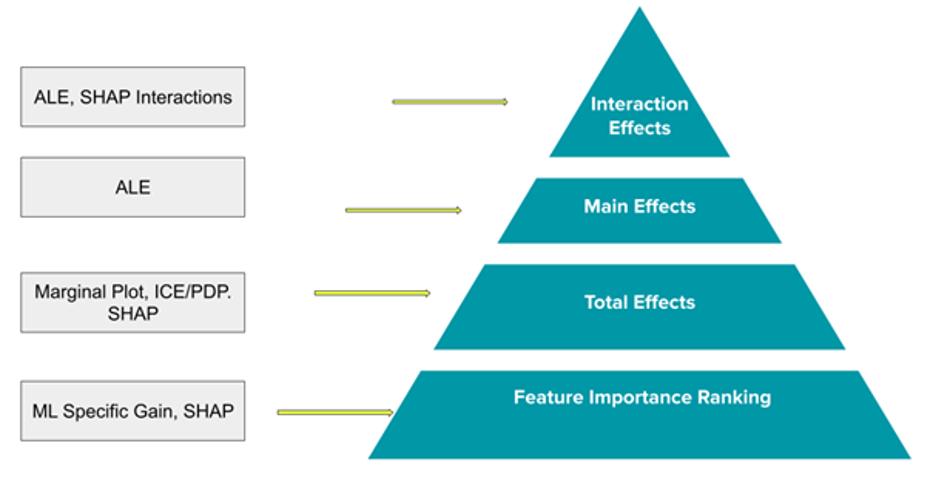
Our Model Explainability Toolbox relies on model-agnostic techniques that can be used on any machine learning model, no matter the complexity. Our framework is designed with flexibility in mind and does not depend on the intrinsic architecture of a model. The techniques focus on feature relevance and visualization to answer questions about model reasoning. Specifically, we focus on Feature Importance, Feature Impact (Total and Main Effects), and Feature Interaction Effects.

On the right of Figure 1 are the focus areas to help make models more explainable, ranging from general (feature importance) to specific. For each focus area, there are specific tools and techniques we will use to answer these questions, briefly described below.
PDP (Partial Dependence Plot)
A PDP explains the global behavior of a model by showing the relationship between the total (marginal) effect of one or two predictors on the response variable. PDP plots are easy for stakeholders to understand, as they provide a visual representation of how one or two features influence the predicted outcome of the model while marginalizing the remaining features. The disadvantages of PDPs are that they assume that the feature of interest (whose partial dependence is being computed) is not highly correlated with the other features. If the features of the model are correlated, then PDPs may not provide the correct interpretation.
ICE (Individual Conditional Expectation)
An ICE plot offers a more granular view of a PDP. While PDPs show the average prediction across all instances, ICE plots show the prediction for each instance individually. (A PDP is the average of the lines of an ICE plot.) Since ICE plots display more information, they can provide more insights such as interactions. The disadvantage of ICE plots is that the plots become overcrowded. For example, while PDP supports two feature explanations at a time, using ICE we can explain only one feature at a time without the plot becoming difficult to read.
SHAP (SHapley Additive exPlanations)
Shapley values are a solution concept found in cooperative game theory that proposes an approach for splitting the rewards from a game fairly among different players. The analogy for model interpretation is that Shapley values can be used to split the output of a model fairly among different features. Roughly speaking, the Shapley value of a feature is its average expected marginal contribution to the model’s decision, after all possible combinations of features have been considered. Shapley values are additive, allowing us to decompose any prediction as a sum of the effects of each individual feature value.
ALE (Accumulated Local Effects)
ALE is similar to Partial Dependence in that they both aim to understand how a feature influences the response variable on average. However, ALE helps mitigate the problem of correlated variables that leads to incorrect interpretation of Partial Dependence Plots. A drawback of PDPs is those feature combinations that are unlikely to ever occur are used in calculating the plot. ALE mitigates this by using only the conditional distribution of a feature; for example, if the feature of interest has a value of x1, ALE will only use the predictions of instances with a similar x1 value. ALE also mitigates the problem of correlated variables by using differences in predictions instead of averages.
Applying the Framework
Step 1: Feature Importance Ranking
For feature importance, we propose using SHAP feature importance as the primary measure. SHAP feature importance is calculated as the mean of absolute Shapley values for each feature across the data. SHAP feature importance is model-agnostic and accounts for feature interactions. However, it is important to compare different feature importance metrics and not rely on any single metric. SHAP feature importance is a variance-based importance measure, meaning that the most important features are the features that contribute the most to the output variance. If the model at hand has built-in gain metrics, metrics that measure a feature’s contribution to an improvement in accuracy, the gain metrics can be used as a sanity check and measure of comparison with SHAP. See Figure 2 below for sample output comparing three feature importance metrics.

Step 2: Individual Feature Impact
Once we determine the feature importance ranking, the next step of our explainability framework is to investigate individual feature impact for those important features. Components of individual feature impact are best understood by visualization. For visualization of relationships of features with predictions, we will use:
- Empirical plots for the observed relationships;
- ICE/PDP plots for the total effects of uncorrelated features;
- SHAP Dependence plots for the total effects (of both correlated and uncorrelated features);
- ALE plots for the main effects.
Empirical plots refer to the plots that show the predictions and actuals against different feature values. Empirical plots differ from partial dependence plots in that they use actual feature values and avoid using unlikely data instances. They are simple and intuitive representations of the relationship between the feature values and the predictions and only leverage actual observed data. They are very useful for granularly examining model errors across the full spectrum of feature values. See Figure 3 below for a sample Empirical plot.

Empirical plots may have blind spots when data is sparse for some feature values. ICE/PDP complements the empirical plot by covering the full range of possible feature values, but they are often biased by unlikely observations due to feature correlations. They are mostly useful for examining uncorrelated features.
‘Total effect’ refers to the total feature impact on the predictions as a combination of a feature’s individual ‘main effect’ and any impact due to ‘interactions’ with other features. PDP/ICE plots and SHAP summary and dependency plots can be used to examine the total effects of individual features.
PDP plots show whether the total effect of an uncorrelated feature is linear, monotonic, or more complex. While ICE plots show the predictions for each permuted observation, PDP plots are the average of ICE. PDP plots are useful to uncover the overall relationship between predictions and feature values while ICE plots are useful to uncover heterogeneous effects, such as interactions, across features. See Figure 4 below for a sample ICE/PDP plot.

SHAP summary and dependence plots show total effects for both correlated and uncorrelated features at the individual observation level. These plots are very useful for showing the variance of impact over different feature values across data points. The SHAP summary plot combines feature importance with feature effects; the color shows the feature value and the density at each value indicates the distribution of Shapley values. For each data point, the SHAP value is interpreted as the marginal contribution of a feature value to the difference between actual and sample mean predictions. While SHAP summary plots show all important features stacked to aid in comparison, SHAP dependence plots show only one feature to aid in better resolution. See Figure 5 and Figure 6 below for a sample SHAP Summary Plot and SHAP Dependence Plot.


Figure 5. SHAP Summary Plot Figure 6. SHAP Dependence Plot
While ICE/PDP and SHAP plots help to visualize the total effects, which is a combination of main effects and interaction effects, it is very important to understand the main effects. To understand the main effects, we leverage ALE plots. ALE plots account for feature correlations and prevent unlikely data points. By observing ALE plots we develop an understanding of the average main feature impact over different feature values. The slope of ALE plots is analogous to a coefficient in linear regressions. See Figure 7 below for a sample ALE Plot.

Step 3: Feature Interactions
One of the key elements in understanding a predictive model is examining its features’ interaction effects. When feature interaction effects are present in a model, the prediction can not be expressed as the sum of the feature effects, because the total effect of a feature varies across the values of another feature.
Complex models like most ML models, generally include a significant number of interactions, therefore it is important to identify the most important interactions and the magnitude and direction of those.
We leverage three different methods to examine feature interactions:
- Friedman’s H-Statistic
- Two-way ALE plots
- SHAP dependence plots with interactions.
Friedman’s H-Statistic measures how much of the variation of the model prediction depends on the two-way interactions. It is a theoretically intuitive method that measures the overall interaction strength. This answers the question of which interactions are the most important. See Figure 8 below for a sample.

Two-way ALE plots and SHAP dependence plots explain how much and to which direction features interact. Two-way ALE plots provide intuitive visualizations of interaction effects and are generally consistent with SHAP dependence plots. The main benefit of two-way ALE plots lies in the fact that they only show interaction effects, separated from the main effects.

SHAP dependence plots have a better visual appeal since the plot colors indicate the input value of a second feature. A clear separation of colors will help illustrate the slope differentials for different values of the second feature.

Figure 10. SHAP Dependence Plot for Interactions